Glass Pack Pro - Icon Pack
- 4.7
- Rating
- 10.00K
- Installs
- $2.49
- Price
 Analysis by App-foxy
Glass Pack Pro - Icon Pack is the kind of personalization app I notice most when I want my Android home screen to feel calmer without rebuilding the entire launcher setup. I tested it as a visual tool rather than treating it like a simple collection of replacement symbols, and my first impression was clear: the translucent glass style works best when the rest of the screen is deliberately restrained. With busy wallpapers, crowded widgets, or mixed icon styles, the effect can lose its polish quickly.
Developed by Nate Wren Design, this paid app sits in the personalization category and is listed at $2.49. It has an Everyone content rating, supports Android 6.0 and later, and its current version is 3.9.5. The app has reached over 10 thousand installs, with a 4.7 average from more than 500 ratings and over 100 written reviews. Those figures suggest a small but clearly interested audience, and my experience explains why: this is a focused visual package rather than an all-purpose launcher replacement.
How the glass look works in everyday use
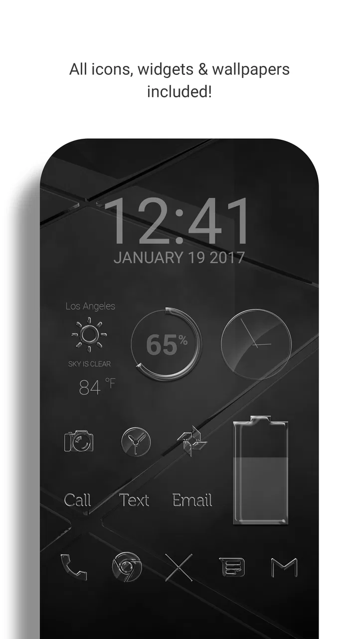
The central idea is a large collection of translucent glass icons paired with dark wallpapers and a matching widget suite. The visual language is immediately recognizable. Instead of placing bright, solid logos on the home screen, the icons soften familiar app symbols into pale, semi-transparent shapes. That gives the screen a more unified appearance, especially when the wallpaper uses black, charcoal, navy, or another low-contrast background.
You May Also Like

 Blood Strike: 2.5 Anniversary
Blood Strike’s Loadouts Turn Every Drop Into a Tactical Gamble
A close look at Blood Strike’s custom loadouts: how fast access to signature weapons reshapes its battle royale rhythm, rewards preparation, and narrows the gap between fights.

 Pandora - Music & Podcasts
Pandora’s Music Is Easy to Start, but Harder to Recover
Pandora’s strength is its low-effort path from a seed to a station. Its weak spot is how much confidence it asks you to place in connection, setup, and quiet recovery.

 8 Ball Pool
 Is Built on Rivalries, Rematches, and Routine
A close look at the rivalries, rematches, shared routines, and unanswered safety questions that turn a quick pool match into a persistent mobile community.

 Samsung Music
’s Quiet Strength Is Playing What You Already Own
Its reach comes less from spectacle than from dependable access to a personal library. That simplicity is both the app’s strongest retention engine and its ceiling.

 AccuWeather: Weather Radar
AccuWeather Review: A Quick, Clear Forecast for Everyday Decisions
For everyday plans, the best forecast is the one you can understand quickly. AccuWeather makes rain timing, radar, and local conditions easy to act on, with a few trade-offs.

 Hill Climb Racing
Why Hill Climb Racing Still Turns Crashes Into One More Run
A tiny car, a bumpy hill and one more upgrade: Hill Climb Racing keeps resurfacing because its simple chaos makes every near-miss feel personal.
More From Our News Desk
View All News


I found the style most convincing on a phone with a simple layout: a few essential apps on the first page, one or two folders, and a widget that does not compete with the icons. The glass treatment creates a sense of depth, but it is not a magic fix for poor organization. If every available shortcut is placed on one page, the pack can make the screen look decorative without making it easier to use.
The dark wallpapers are important because they are not just an extra download to ignore. They provide the visual space that lets the translucent edges remain visible. On a bright photograph or a highly detailed illustration, some icons can blend into the background. I would begin with one of the darker backgrounds, arrange the main shortcuts, and only then decide whether a personal wallpaper still preserves enough contrast.
The widget suite also affects the result. A glass icon set beside a standard, brightly colored widget can look mismatched, while a coordinated widget makes the whole page feel intentional. I would not install every widget simply because it is included. The better approach is to choose one useful panel, such as a clock or information area if it fits your launcher, and leave breathing room around it.
One practical strength is the scale of the collection. With more than 6,000 translucent icons, the pack is designed to cover much more than the handful of popular apps most people use every day. That matters if your phone includes specialist tools, shopping apps, banking apps, games, streaming services, or work utilities. A large library reduces the temptation to accept a random substitute that breaks the visual consistency.
Coverage still needs to be judged by your own app drawer. A large catalog does not guarantee that every niche application you use will have a dedicated design. When an icon is not covered, the result may depend on the launcher’s fallback behavior or on whether the pack offers a suitable alternative. I would check your less common apps early, before spending time arranging several home screens around the theme.
Installation is only the beginning
Because this is an icon pack rather than a complete home replacement, the launcher matters. The experience can differ depending on whether your launcher supports third-party icon packs directly, needs a separate settings step, or handles widgets in its own way. I would not judge the pack by the first screen alone; I would open the launcher’s icon settings, apply the theme there, and then inspect folders, the app drawer, and any secondary pages.
This distinction is easy to miss. Someone expecting the app to redesign the entire phone automatically may find the setup less immediate than a launcher with built-in themes. On the other hand, keeping the pack separate is useful if you already like your launcher, gestures, page arrangement, and app-drawer behavior. You can change the appearance without giving up the navigation system you already know.
My preferred workflow is to create a temporary test page first. I place frequently used apps, a folder with several less common apps, and one widget on it. That reveals three things quickly: whether the launcher applies the icons correctly, whether the glass edges remain readable, and whether the widget’s proportions suit the page. It is much easier to adjust a test page than to repair a fully customized layout.
Folders deserve special attention. A themed icon may look excellent on the home screen but become harder to identify when several pale symbols are reduced inside a folder preview. I found that grouping apps by task rather than relying only on their visual shapes is more dependable. For example, a folder named “Travel” or “Bills” remains useful even when the icons are intentionally subdued.
Trust, controls, and what I would check before installing
For a personalization app, the most reassuring starting point is its narrow purpose. Glass Pack Pro is presented as a visual customization tool from Nate Wren Design, not as a social network, messaging service, or account-based platform. That makes the decision easier for me than with an app that asks for access unrelated to changing the appearance of a launcher.
Still, I would not turn that into a promise about permissions or data handling without checking the current store privacy section and the Android permission prompt on the device. Those are the places where I would verify what access is requested, whether any account is needed, and what choices are offered during installation. The app’s price also means I would review the purchase screen carefully and confirm that I am obtaining the intended icon pack rather than assuming every launcher feature is covered automatically.
There is no reason to hand over personal information simply to arrange icons, so I would pay attention to any sign-in request or optional form. If a screen asks for an account, I would read why it is needed before continuing. If the app can be used without one, I would choose that route. This is a small but useful habit: keep the customization local and the user choices visible whenever the app allows it.
The same caution applies to data-sensitive moments. A launcher theme may touch the list of installed applications because it needs to match app names with icon designs, but the exact handling of that information is something I would verify in the live permission and privacy screens rather than infer from the visual purpose. I would also check whether optional analytics, notifications, or promotional settings appear during setup and disable anything I do not need.
On a shared or work-managed phone, I would be especially deliberate. A personal device used for banking, company apps, or private communications deserves a quick permissions review before any customization tool is installed. The theme itself may be harmless visually, but the correct trust decision comes from the app’s current disclosures and the choices Android shows at installation time.
I also appreciate that a paid app changes the comparison slightly. The upfront cost is modest, but it gives me a clear expectation that the core experience should not depend on aggressive advertising. I would still inspect the purchase details and update notes in the store, particularly because launcher compatibility can change as Android and individual launchers evolve.
Where the design succeeds and where it becomes inconvenient
The strongest part of the pack is consistency. Standard icons from different developers often clash because each uses its own colors, shadows, and visual proportions. The glass treatment reduces those differences. On my home screen, that made the page feel less like a collection of unrelated shortcuts and more like one designed surface.
That same consistency creates a trade-off: recognition can be slower. Bright brand colors are useful visual cues, and the pack intentionally tones them down. I learned to rely more on position and folder names, especially for apps I open repeatedly throughout the day. If you identify apps almost entirely by their original logo and color, the transition may feel less convenient than attractive.
Accessibility is another reason to be selective. Translucent symbols and dark backgrounds can produce a refined look, but not every combination has the same readability. Users who need strong contrast may prefer the phone’s default icons or a pack with solid, high-contrast shapes. I would test the theme with larger display settings, reduced brightness, and outdoor light before committing to every page.
Notifications can also affect the visual balance. Some launchers place badges over themed icons, and a pale icon with a bright notification dot may look different from the screenshots or preview arrangement you have in mind. That is not necessarily a fault in the artwork, but it is a reminder that the launcher controls part of the final appearance.
The widgets are useful for a coordinated look, but they may not replace the specialized widgets you already depend on. If you need a detailed calendar, task list, music controller, or smart-home panel, the best solution may be to keep that existing widget and use the glass pack only for icons and wallpaper. I prefer a functional mixed setup over a perfectly matched page that makes daily tasks slower.
Useful setups for different kinds of users
For a minimalist home screen, I would use the pack on a single page with only the apps I open most. A dark wallpaper, a small number of shortcuts, and one restrained widget let the translucent edges stand out. This is the setup where the app feels most distinctive, because the theme is given enough empty space to breathe.
For a work phone, I would use folders and labels more aggressively. Put communication, documents, meetings, and finance apps into named groups rather than expecting the softened symbols to communicate everything instantly. The result can still look polished, but the labels preserve speed when the visual treatment makes individual logos less obvious.
For a family device, I would be more cautious. If several people use the phone, or if someone relies on quick recognition rather than aesthetic consistency, the default icon style may be easier. The pack is a better fit for a user who enjoys adjusting layouts and is willing to learn the new visual cues.
For someone who changes wallpapers often, the pack may require more maintenance. The glass effect is not equally readable against every image, so each wallpaper change should be followed by a quick check of the busiest page. A plain dark background is the safer choice, while bright gradients and detailed photos may require moving icons or changing their arrangement.
One non-obvious advantage is that the pack can make a mixed collection of apps feel less distracting. I found that removing the strongest brand colors reduced the visual temptation to jump between apps. That will not replace notification controls or good screen-time habits, but the quieter surface can make the phone feel less like a wall of competing prompts.
Another useful trade-off concerns discoverability. If you are setting up a new phone, themed icons can hide the fact that several apps perform similar jobs. I would first organize and remove unused shortcuts with the default appearance, then apply the pack afterward. That two-stage process prevents the attractive design from masking clutter.
A third practical tip is to keep a record of the original launcher layout before experimenting. Icon packs change appearance, not necessarily the underlying arrangement, but launcher resets, device migrations, or switching launchers can still create confusion. Taking a screenshot of the default pages gives you a visual reference when you want to undo the theme or compare it with another option.
How it compares with ordinary alternatives
The default Android icon set is the easiest alternative because it requires no setup and usually offers the strongest recognition. It is the better choice if you value immediate clarity, accessibility, or a consistent experience across multiple devices. Glass Pack Pro is more appealing when the default icons feel visually noisy and you are willing to trade some instant recognition for a calmer design.
Free icon packs can be attractive if you want to experiment without paying, but they often vary in coverage, presentation, or update attention. The paid model here makes sense for someone who wants a substantial glass-themed collection and matching visual elements in one purchase. I would not choose it merely because it is inexpensive; I would choose it because this particular translucent style matches the phone I want to use.
A full custom launcher is the more powerful alternative. It may offer deeper grid controls, gestures, icon resizing, and broader theme management, while this app focuses on the artwork and related visual pieces. If your main goal is automation or a radically different navigation system, a launcher is the better starting point. If your launcher already works well and you only want a new surface, keeping the two roles separate is simpler.
Other icon packs may be better for high contrast, colorful branding, or a particular illustration style. The glass design is intentionally understated, so it is not a universal recommendation. I would skip it if you want bold colors, large solid symbols, or a theme that remains equally legible on any wallpaper.
My cautious verdict after living with the theme
I recommend Glass Pack Pro to Android users who enjoy deliberate home-screen design and want a large, unified icon collection without replacing their launcher. The dark wallpapers and widget suite help the theme feel like a complete visual direction rather than a random set of symbols, and the broad library gives it more practical value than a tiny novelty pack.
I would approach it with realistic expectations. The app cannot decide which layout suits your habits, and its translucent style may reduce quick recognition or contrast in some situations. Launcher compatibility, widget behavior, and privacy choices should be checked on your own device before you finish the setup. Those are not reasons to avoid it; they are the details that determine whether the polished look remains useful.
At $2.49, I see it as a focused purchase for people who already know they like the glass aesthetic. If you are undecided, test the included wallpapers and a small group of daily apps first, then examine the result in bright light and with notifications active. If the screen still feels clear, the pack can give an older Android layout a surprisingly fresh identity.
My final advice is simple: choose this app for its specific visual character, not just for the promise of changing icons. When paired with a dark background, a restrained page layout, descriptive folders, and a launcher you already trust, it creates a quiet, coherent home screen. When readability and instant recognition matter more than style, the default icons or a solid high-contrast pack will serve you better.
FAQs for Glass Pack Pro - Icon Pack
01What is Glass Pack Pro - Icon Pack?
Glass Pack Pro is a customization app for Android devices that replaces standard app icons with a coordinated glass-style design. After installing a compatible launcher, you can apply its icon collection to supported applications, giving your home screen a cleaner and more consistent appearance. It is designed for users who enjoy minimalist, translucent, and modern visual themes.
02Which Android launchers are compatible with Glass Pack Pro?
Compatibility depends on the launcher installed on your phone, but Glass Pack Pro generally works with many popular third-party launchers that support icon packs. The exact steps for applying it can vary between launchers, so it is worth checking the pack’s supported-launcher list and your launcher settings before downloading. Some manufacturer launchers may not support external icon packs.
03How do I apply Glass Pack Pro icons to my home screen?
First, install Glass Pack Pro and make sure you have a compatible Android launcher. Open the launcher’s appearance, theme, or icon settings, then select Glass Pack Pro from the available icon-pack options. Some launchers also allow you to apply the pack directly from the app. If an icon is not included, you may need to use a custom shortcut or leave that application unchanged.
04Does Glass Pack Pro include icons for every application?
No icon pack can guarantee coverage for every application, especially newer, regional, or less popular apps. Glass Pack Pro may include a substantial collection of commonly used icons, but unsupported apps can still appear with their original icons. Depending on your launcher, you may be able to request missing icons, manually assign an alternative icon, or use a matching generic design.
05Is Glass Pack Pro free, and does it affect phone performance?
The availability and pricing of Glass Pack Pro can depend on the version listed in the app store, so users should review the current download page for purchase details and any included features. An icon pack normally has a very small effect on performance because it mainly changes visual assets. However, a heavily customized launcher or animated wallpaper may use more battery or memory.
Pros
- Large collection of polished glass-style icons
- Consistent visual design across many app categories
- Includes matching wallpapers for a complete home-screen look
- Frequent updates can add support for newer apps
- Works with several popular Android launchers
Cons
- Not compatible with iPhone or iPad home screens
- Some apps may still use generic or missing icons
- Requires a compatible launcher for full customization
- The glass effect may reduce icon readability for some users
- Premium features may require an additional purchase

Glass Pack Pro - Icon Pack
Gallery